Looking to get more out of your Salesforce reports and dashboards? Salesforce is a powerful tool for tracking and managing customer data, but it can be challenging to use effectively. With the right tips and tricks, you can maximize your productivity and reach new heights in your sales career. There are many ways to use a Salesforce dynamic dashboard to improve your workflows and get a better picture of your business operations. By following these tricks, you can boost your productivity and see results fast.

What Are Salesforce Dashboards?
Salesforce dashboards let you see changing business conditions so you can make decisions based on real-time data from reports. As a result, reports and dashboards in Salesforce have a special relationship. Use dashboards to assist users in categorizing numbers, identifying patterns, and measuring the effectiveness of their operations from existing reports. Following your mastery of the Salesforce data model, mastering dashboards and reports will become a logical next step in your Salesforce journey.
14 Salesforce Dashboard Tricks to Try
Salesforce is a popular customer relationship management (CRM) software that lets businesses manage their sales and customer data in one place. You can use it to track leads, contracts, and customer data. The following Salesforce dashboard tricks can help you improve your customer relations, track your progress, manage your resources more effectively, streamline your sales processes, and make better decisions about your business. Here are 14 dashboard tricks you can use to improve your workflow with Salesforce.
1. Interactive Salesforce Dashboard Filters
Filters are an essential component of every dashboard or report. They aid in providing organized and structured replies by allowing users to apply a set of values to filter the results. Filters are essential to expanding user interaction with data beyond a surface level. That’s why we’re kicking off this list of tricks with interactive filters.
Do you have a team that spans different countries, regions, or industries? Salesforce’s Lightning Reports allow users to choose the filters that are important to them. You can build a global dashboard that managers can access to see how their teams perform. A Director managing teams from multiple nations can efficiently utilize a Salesforce dashboard filter to swap between country teams to compare performances. Explore all there is to know about dashboard filters (Salesforce).
2. Stacked Summaries
Stacked summaries alter the way reports group data. It provides a subtle yet significant change. Users can quickly summarize large amounts of data for faster examination and comparison. In short, stacked summaries create customized report views in Salesforce. The improved Lightning Report Builder enables the stacked summaries feature by default. However, you can activate this view when you add fields to both rows and columns, or when toggled on or off at the bottom of the Report Builder.
For example, an opportunities report for a sales pipeline can show you a compact and summarized table of the number of opportunities in each stage and each opportunity owner’s sub-total of qualification opportunities. With the stacked summaries toggle enabled, you can examine record counts by country, opportunity owner, or any sub-total counts by which your report is organized.
3. Dynamic Salesforce Gauge Chart
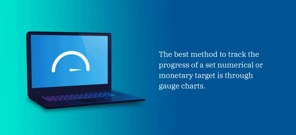
The best method to track the progress of a set numerical or monetary target is through gauge charts. In contrast to the standard mode, where numbers represent segment ranges, the target segments in the dynamic mode are represented by percentages. To enable dynamic gauge charts, an admin of the account must enable it in the Reports and Dashboards User Interface settings. After selecting the gauge chart for your report and enabling the setting, the dynamic option becomes available for selection.
It’s worthwhile to emphasize the impact this dynamic mode inside gauge charts may have across several teams within an organization—particularly for those that rely heavily on Salesforce reporting to measure their key performance indicators (KPIs). For instance, a Sales team can track their quarterly and regional sales goals, and a Support team can track their average response times to clients.
Learn more about Dynamic Gauge charts and how they undoubtedly provide users with unified reporting while reducing the number of individual components, reports, and time spent visualizing the essential statistics.

4. Light vs. Dark Mode
Users can vary between light and dark modes for each component in a Lightning dashboard, or even use a new color palette, to direct report viewers’ attention to the most relevant facts. You can choose from various color palettes, including light or dark themes. You may even alter each component’s light or dark setting, giving you even more flexibility.
Switching between light and dark modes is especially handy if you have different dashboards for the Sales team based on area, time period, and industry. To display a more appealing view of a dashboard showing target revenue versus actual revenue, click properties at the top right page of the dashboard, then scroll to the bottom to select a different dashboard theme or palette.
Additionally, you can also change the respective colors shown in each value range using specific components such as gauges and metrics. These components default to green, yellow, and red—although Salesforce provides several options for customizing the color.
5. Daily Admin Dashboard
An administrative dynamic dashboard is a tool that can assist you in staying organized and on top of your work. It may also save you time by allowing you to quickly access the most critical information for the day. It will enable you to keep track of all of their clients without having to log in to each organization every day while also allowing you to respond to critical financial questions quickly and accurately.
A few key components to include in a daily admin dashboard have active users or the number of employees, licenses used or licenses purchased, API calls per day, and monitoring community logins.
6. Dynamic Reports
If users need to see a report with different filters that cater to their specific requirements, they don’t need to edit the entire report—nor create an entirely new one. Instead, users can alter the filters of a single existing report using the Lightning Report Filter tool while keeping the saved report filters intact.
Dynamic reports are helpful in scenarios where multiple users, like the Management team, can access a single report. Different heads of management may switch between different views of the report to fulfill their needs. Instead of saving numerous copies of the same report, add a filter and leave the filter value blank. This way, multiple users can apply their specific filter to a report without altering the main structure of the report. Learn more about filtering report data in Salesforce.
7. Dynamic Dashboards
By default, a Salesforce dashboard will present values from the perspective of one user, regardless of who views it. This feature allows users to remove their security constraints to view high-level data summaries temporarily. When constructing a sales dashboard, for example, selecting a Sales Manager as the primary user allows any salesperson to understand the whole team’s performance.
Meanwhile, dynamic dashboards in Salesforce ensure that various users see a dashboard differently, dependent on their security access. You may utilize this feature to create one that displays a single Sales Rep’s deals, a Sales Manager’s deals, and the Sales Director’s deals across the organization. You need a new standard dashboard for each user to replicate such a feature.
Salesforce gives you a limited amount of dynamic dashboards, so you choose wisely. Consider the audience and functionality for each—do I want everyone to see the same thing, or do you want each user to view only their specific information? Feel free to read more about dynamic dashboards in Salesforce’s Lightning or dynamic dashboards in Salesforce Classic.

8. Print Dashboards
Although many have adopted online and electronic alternatives for managing organizations, there are still some scenarios where you’ll need physical papers of information—like dashboards. Previously, you had to screenshot the dashboard or alter your screen resolution or zoom settings to take a picture of the dashboard.
Now you can print a dashboard with a click of a button. Always refresh your page before downloading your dashboard to ensure it displays the most recent information. You’ll find a dropdown arrow at the top-right of your dashboard where you can select the Download option. Downloading a dashboard allows you to print your dashboard physically and attach it to an email.
9. Account-Based Engagement Dashboards
Bigger organizations typically isolate the Marketing and Sales teams. This means their KPIs need to be linked, or it’s just not part of the daily workflow and discussion. This is where account-based marketing (ABM) and account-based engagement (ABE) dashboards come into play. A good dashboard defines the metrics that are important to these teams.
It’s worth noting why an ABE dashboard is so effective for sales—based on activities or engagement. Each organization perceives activities differently. Some organizations may see engagement as calls and emails, while others see them as website visits and conversions. These insights can show what engagement types best work for a team.
10. Pardot Grading Dashboards
Even though a prospect is active and interested in your organization, they are still determining if they are a suitable fit for your company. Consider how well your prospects match your desired client profile. That’s when a grading system can come in handy.
The Pardot grading system indicates how closely a prospect matches your ideal client profile. Each prospect receives a letter grade between A and F based on comparing their data to your organization’s selected ideal criteria. A indicates that the prospect’s criteria are a great fit, whereas F means a poor fit.
You create your own grading scheme based on your company’s goals and the qualities your organization considers an ideal buyer. Reporting is crucial for proving that marketing teams are sending quality leads to the pipeline. Smarter lead qualification requires a Pardot grade. Prospect grading, when set up and applied correctly, may have a significant influence on your business.
11. Folder Management
A folder contains and organizes your account’s dashboards, reports, papers, and even email templates. Folder management allows you to control information access. You need to have centralized control over files that are dispersed across the account. Keeping files together in a file management system can assist you in controlling access to important papers.
Account admins manage dashboard access by keeping them in folders with different visibility settings. Dashboard folders can be made public, hidden, or limited to specific roles, groups, license types, and permissions. You can examine a folder’s dashboard if you have access to it. Users must also have access to the folder containing the underlying source report to view a dashboard component. Learn more about managing folders in Salesforce.

12. Custom Reports
Salesforce reporting may be the most helpful tool you have at your disposal. Given the quantity of information in your Salesforce account, you must understand how to construct a custom report so that your users can examine the data that is relevant and valuable to them. You can modify existing reports or create custom reports from scratch to meet your company’s specific needs.
So, before you build any dashboard components, ensure that you have your essential reports set up that you’ll use as source reports. Additionally, ensure that you save these reports in folders that your intended dashboard viewers can access. Learn how to build reports in Salesforce Classic or in Lightning Experience.
13. Summary Formulas
Create summary formulae to analyze the group subtotals and grand totals in a report. Instead of waiting for your admin to create a field for you in Salesforce’s back end, you can crunch numbers as you produce reports, like in Excel, using these formulae—allowing you to apply one-off calculations to graphs quickly.
The summary formulas feature allows you to create Salesforce reports that calculate profits from each won opportunity and sales tax for each opportunity and graph the difference between the minimum and maximum donation sizes in each area. Here’s how you can add a summary formula column to a report.
14. Bucket Columns
The bucket column in Salesforce is a useful report and documentation feature that allows you to rapidly classify report entries without developing a formula or a custom field. Thus, a bucket is a custom category that you build in reporting. When constructing a bucket column, you can add several types or buckets to organize report information. Like any other report column, you may filter, sort, and group by bucket columns.
For instance, you want to see all your accounts based on how many staff you have. Based on the number of employees’ data, create a bucket column named “size.” Next, add buckets that aggregate records into small, medium, and large ranges. These ranges will differ based on your unique organization—however, small can mean 5,000 or fewer employees, medium can be between 5,000-10,000 employees, and large mean 10,000 or more employees.
You may now filter, sort, and group data based on how they are organized in buckets. When one account expands or contracts, it immediately transfers buckets. Discover how you can add bucket columns in your reports.
Schedule a Demo With AutoRABIT
Now you can apply what you’ve learned from these handy Salesforce dashboard tricks to make the most of your data. AutoRABIT can help you achieve continuous integration (CI) and continuous delivery (CD) while avoiding faults and maintaining the availability of mission-critical Salesforce data. Schedule a demo today for more information.
